A Storybook Home Designed for Modern Living
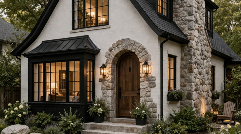
Most small homes try to be efficient. This one does something harder—it creates emotion. From the first glance, the curved rooflines and oversized stone chimney feel like they belong in a fairytale, yet the sharp black-and-white palette keeps it grounded in modern design. That contrast is what makes this house work. Without it, this would just be another “cute cottage” lost in a sea of Pinterest clones. The exterior is disciplined. Clean white walls, black-framed windows, and a defined structure give it architectural strength. Then the stone breaks that discipline on purpose. The chimney isn’t subtle—it’s dominant, textured, and unapologetically heavy. That imbalance is exactly what gives the house character. If everything matched perfectly, it would be boring.
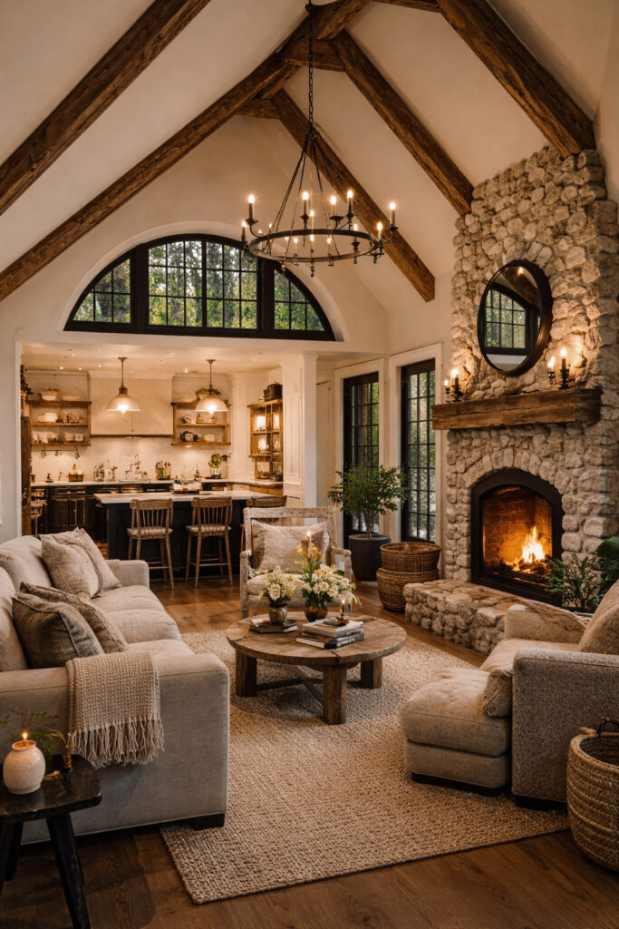
Step inside and the house stops trying to impress—and starts trying to hold you. The vaulted ceilings with exposed wooden beams create vertical drama, but the furniture pulls everything back down to human level. That’s smart. A lot of designs mess this up—they go big on architecture and forget comfort. This one doesn’t. The stone fireplace anchors the entire space. It mirrors the exterior chimney, creating continuity instead of randomness. That’s intentional design thinking. The round mirror above the fireplace softens the rough texture of the stone, preventing the room from feeling too heavy. The kitchen flows directly into the living area without fighting for attention. It stays in the background, which is exactly where it should be in a home like this. If the kitchen tried to be flashy, it would ruin the calm.
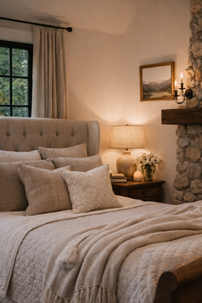
Here’s where most designs fall apart—and this one almost does too. The bedroom plays it safe. Neutral tones, soft fabrics, warm lighting—it’s all correct, but it’s also predictable. The saving grace is restraint. Nothing is overdone. No unnecessary decor, no forced “design moments.” Just a space that understands its role: rest. The textures carry the room. Layered fabrics, subtle wood tones, and soft lighting create depth without needing bold colors. It’s quiet design. Not exciting—but effective. If you wanted to push this further, you’d introduce one contrasting element. Right now, it’s almost too safe.
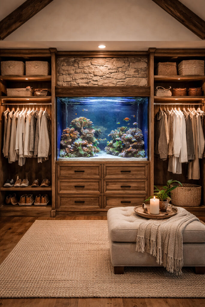
Finally, some risk. The built-in aquarium isn’t just a feature—it’s a statement. It turns a functional space into something memorable. Most closets are dead zones. This one becomes an experience. The symmetry of the cabinetry keeps things structured, while the aquarium breaks that structure just enough to keep your attention. That balance is hard to pull off, and here it works. This is the kind of element that separates a “nice home” from a brandable one. People remember this.
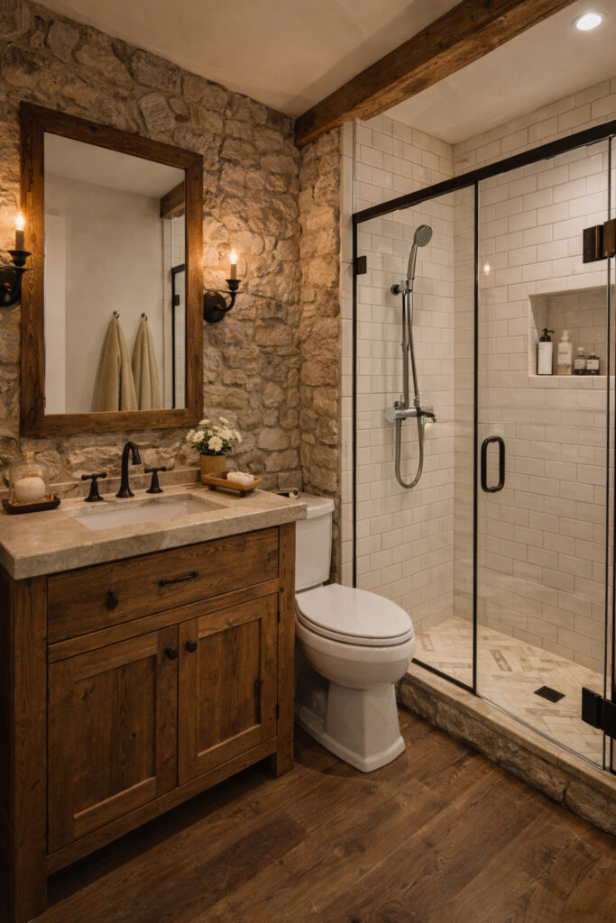
The bathroom is where materials do all the talking. Rough stone walls meet clean subway tiles. Warm wood meets sharp black fixtures. It’s contrast again—but controlled. Nothing feels accidental. The glass shower keeps the space open, which is critical in a smaller layout. A closed-off shower here would kill the room instantly. Instead, everything flows, visually and physically. It’s practical, but not boring. That’s the line most bathrooms fail to walk.
This house works because it understands tension.
Soft vs. strong. Rustic vs. modern. Simple vs. statement.
Most designs pick one direction and stay there. That’s safe—and forgettable. This one pushes just enough in both directions to stay interesting without becoming chaotic.
But don’t get it twisted—it’s not perfect. The bedroom plays it too safe, and without standout elements like the aquarium or chimney, this house would lose its identity fast.
Still, as a complete concept?
It’s tight. It’s cohesive. And most importantly—it’s memorable.
That’s what actually matters.