A Rustic Cabin That Gets It Right
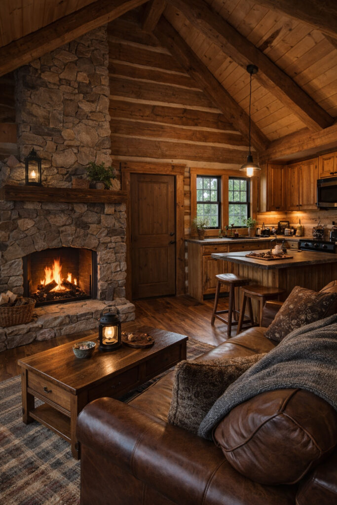
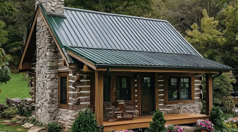
Most “cozy cabin” designs you see online are trying too hard. Too polished, too staged, too fake. This one? It actually works—and not by accident. From the outside, the structure keeps things brutally simple. A compact footprint, a steep metal roof that actually handles weather instead of pretending to, and a stone chimney that isn’t decorative nonsense—it’s the visual anchor of the entire house. The log construction gives it authenticity, but what really matters is proportion. Nothing is oversized, nothing is trying to impress. That restraint is exactly why it feels real. The porch is doing more work than people realize. It’s not just for sitting—it’s the transition zone that softens the shift between wild landscape and controlled interior. The landscaping isn’t overdesigned either. Low stone borders, simple flowers, no ego. That’s good. Once you start overcomplicating the exterior of a small house, it collapses visually. Step inside and the design doubles down on consistency. The living area, kitchen, and fireplace all share the same language—wood, stone, warmth. No random modern elements thrown in to “spice it up.” That’s discipline. The exposed beams and vaulted ceiling create volume without needing more square meters, which is exactly what small spaces should be doing. If you’re designing tiny homes and you’re not thinking vertically, you’re already failing.
The fireplace is the centerpiece, and it earns that position. It’s not just about aesthetics—it defines the entire emotional tone of the space. Everything orbits around it: seating, lighting, even the kitchen layout. That’s intentional design. Most people scatter focal points and end up with a confused room. This avoids that mistake. The kitchen is compact but efficient. No wasted movement, no oversized island pretending this is a luxury villa. It respects the scale of the house. The materials stay consistent—wood cabinetry, stone textures, warm lighting—so the space feels unified instead of stitched together.
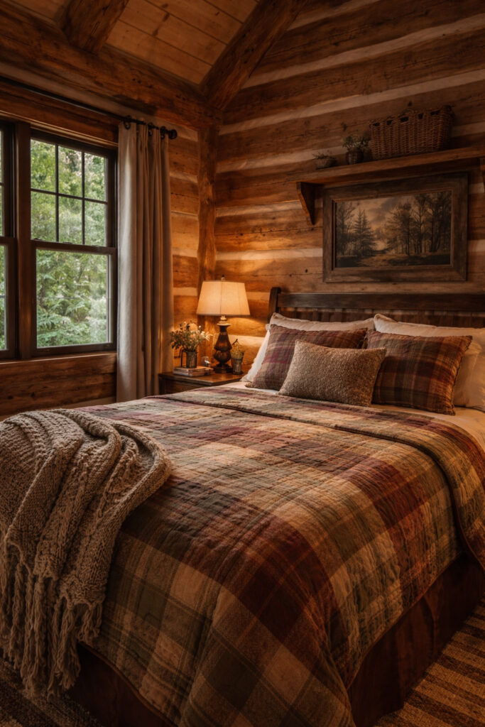
The bedroom keeps the same discipline. It doesn’t try to reinvent anything, and that’s exactly why it works. Soft textiles, warm tones, controlled lighting. It’s built for rest, not for showing off. The window placement matters more than the decor—it frames nature, which is the real asset here. Too many designs forget that the outside is part of the experience.
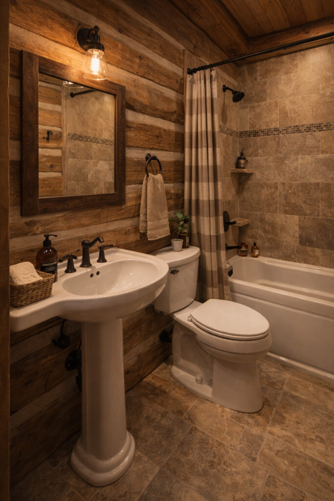
The bathroom is where most small cabins fall apart. Here, it holds the line. It’s tight, but it doesn’t feel like a compromise. The mix of wood and tile keeps it grounded, and the lighting is warm instead of clinical. That alone puts it ahead of most designs that end up looking like cheap hotel bathrooms.
Now here’s the part you probably won’t like: this design works because it’s consistent, not because it’s creative. If you’re looking for something “unique,” this isn’t it. It’s disciplined, coherent, and executed properly. That’s why it wins. Most people chase originality and end up with a mess. This does the opposite—it commits to a clear identity and doesn’t break it.
If you want to improve it, there are obvious moves. The interior could push contrast slightly—right now it leans heavily into warm tones, which can become visually flat over time. A few darker or cooler accents would sharpen the space without breaking the style. Storage is another weak point. It’s clean, but you can tell it’s limited. In a real-world scenario, that becomes a problem fast.
But overall, this is a solid example of what small-space design should look like. Not loud. Not experimental. Just precise, intentional, and built with a clear understanding of what actually matters.